Is Big Tech All You Need?
By Crescent Team
A historical analysis of concentrated results in the S&P 500
Recent narrow market rallies have forced us to focus on market indices and the overall role of the largest stocks. While concentration is hardly a new concern, the contribution to return this year from a handful of big tech stocks (FAAANM) has been staggering.
Despite some cause for concern in terms of diversification, concentration itself is not necessarily a bad thing. Additionally, we postulate that dominance often does not last very long, with recent winners usually falling out of favor eventually. Through further analysis, we continue to believe that remaining invested in a thoughtfully diversified portfolio – and allowing the market to pick winners and losers – remains the best strategy over the long term.
INTRODUCTION
Index concentration has been a popular topic this year, as investors continue focusing on the disproportionate impact that a few large companies, broadly referred to as “big tech” companies, has had on the markets. The performance of these big tech stocks, which hold a significant weight in the S&P 500 index, accounts for more than all of the S&P 500’s returns through September of this year.

A basket of these large technology companies is often referred to by the acronym FAAANM – Facebook, Alphabet, Amazon, Apple, Netflix and Microsoft. Together, this group has contributed 144.4 percent of the S&P 500’s year to date return. Therefore, the remaining companies that constitute the S&P 500 have, on average, detracted from the overall return with a cumulative weighted average return of -44.4 percent. Merely six stocks have driven this year’s rally, a very top-heavy year for the index.
This staggering statistic raises concerns about portfolio construction, most notably for those with a significant allocation to U.S. large cap equities. With six names driving the majority of the index’s performance over this year, investors might be justified in asking whether owning a diversified basket of securities adds any benefit compared to just holding these six names. However, before making any hasty decisions, you need some context for the narrowness and concentration in the S&P 500 index. There have been similar levels of index concentration before in the sample period, but such levels have been relatively limited in persistence for the largest stocks over time.
HISTORICAL CONCENTRATION OF THE S&P 500
To provide some context around historical index concentration, we looked at the weight of the top 1, 3, 5, 10 and 20 stocks in the S&P 500 at the end of each year from 1990 onwards. The graph and table below illustrate that concentration amongst the top stocks is not a new occurrence and that the level of concentration fluctuated over time. However, this year has seen an elevated level of concentration, with the most recent aggregate weights in all baskets mentioned above, except the top twenty stocks, being significantly higher than their historical means and approaching the historical maximums over the sample period. The top three stocks – Apple, Microsoft and Amazon – reached their highest aggregate weight at any point throughout the sample period.


There has been significant turnover in the top stocks over time, with companies falling out of the top tier after only a few years in that position. Although there are companies that win big, they usually dominate for only a few years and lose their pole position soon thereafter[1]. Additionally, building a portfolio of recent winners, while tempting, comes with increased risk, both in terms of heightened volatility and drawdown risk. Thus, staying invested in a thoughtfully diversified portfolio remains the best strategy for long-term investors.
On average, the top 5 and 20 stocks at the end of the previous year have contributed 16.2 percent and 34.9 percent of the annual total return of the S&P 500 over the next year, respectively. Given the mean weights to the top 5 (12.4 percent) and 20 (31.2 percent) stocks at the end of the previous year, these numbers set expectations for contribution to index returns from the largest few stocks in the index.
In 2020, these numbers are 119.9 percent and 106.1 percent through September 30, far surpassing any previous periods. The five largest stocks in the index have dominated the index’s returns over the period, as the remaining stocks in the index detracted from index performance.
Although this year’s numbers are only through September 30, the data tells a very interesting story. Across the board, the contribution to return from the top n stocks exceeded any other point in the sample period.
For the top 20 stocks, after this year’s contribution to index return of 106.1 percent, the next closest was in 2000 (99.8 percent) and 1994 (80 percent).
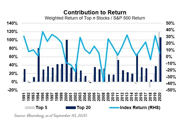

Thus, while we’ve seen periods of high concentration in contribution to index returns before, this year’s extraordinary circumstances led to the contributions to the S&P 500’s total returns from the top n stocks being multiple times larger than the mean – and significantly higher than the second largest value in the sample. Although the magnitude of this contribution is staggering, we don’t believe that the long-term success of such a large market can rest on the back of just a few stocks, as it has thus far in 2020. While there have been recent winners, allocating to just a few names rather than thoughtfully diversifying introduces a high level of idiosyncratic risk that often doesn’t justify the potential returns.
Past performance does not indicate future performance and there is a possibility of loss.
OUTCOMES FROM CONCENTRATED MARKETS
Historically, periods of high concentration in the S&P 500 index were followed by poor outcomes for investors. However, we caution against implying causation here – we believe that the S&P 500’s forward returns and its level of concentration were likely a result of the same investor sentiment and prevailing economic conditions. Periods of high concentration have coincided with time periods leading up to major recessions, such as in the early nineties with the Dot Com Bubble and the 2008 Great Financial Crisis.

Source: Bloomberg, as of September 30, 2020. *Annualized. Past performance does not indicate future performance and there is a possibility of a loss.
Illustrating this point, the table to the left shows that periods of high concentration (in brown and red) have been generally followed by poor returns (red). Lower concentration (green) has been followed by periods of positive performance (green).
For example, in 1995 there was relatively low concentration and returns in the following one, three and five years were high. Soon thereafter, the story was the contrary – 2000 saw incredibly high concentration and was followed by rather disappointing outcomes for investors.
While some may be interested in looking at the degree of concentration within sectors or industries, we decided against performing this analysis for two reasons:
1. Sector classifications are often far from perfect. For example, Amazon is categorized under the Consumer Discretionary sector (which also includes Carmax and Domino’s Pizza), rather than Information Technology. Since it is typically included in discussions of “big tech,” we believe a sector-based analysis would be misleading.
2. The Information Technology sector has consistently held a significant weight in the S&P 500 since 1998, rarely falling below 15 percent.
DECOMPOSITION OF ANNUAL RETURNS
As historical periods of concentration have been followed by lackluster results, it is instructive to decompose the attributes of S&P 500 index returns. In the exhibit below, we show dividend and price returns, with price returns further decomposed into changes in earnings growth and multiple expansion (P/E ratio). We look at the S&P’s returns over each calendar year between 1990 and 2020 and break it up between these three components.
Dividend returns have been the most consistent over time but broadly trended lower over time. Earnings growth has been strongly positive over time, with a few negative outliers during recessionary periods. Multiple expansion has been the most inconsistent over time, with large swings from year to year.


Past performance does not indicate future performance and there is a possibility of a loss.
Deconstructing the returns for the top twenty stocks over time yields a similar pattern of dividend stability; large and positive earnings growth over time; and a highly volatile multiple expansion component of returns. The graph below seems similar to the index-level graph above. Although the earnings growth of the top 20 stocks has generally been higher than that of the broader S&P 500, there have been periods where the top 20 stocks have severely lagged behind the index, such as in 2008, when the top 20 stocks generated a total return of -106.8 percent, compared to -33.2 percent for the index.


Past performance does not indicate future performance and there is a possibility of a loss.
THE RISE OF “BIG TECH”
Given the outsized returns and relative size of the “big tech” stocks, or FAAANM as defined previously, we examined the total returns, valuation and earnings growth for this basket of six stocks. The data begins in 2014, when the last of these seven stocks (six companies) was added to the S&P 500 index – Alphabet C in April 2014. Alphabet A was already a well-established member of the index, having been added in April 2006.
Over this 6 ½ -year period, the FAAANM basket grew nearly six-fold, while the S&P 500 has more than slightly doubled and, excluding the FAAANM basket, the S&P 500 generated slightly lower returns at 81 percent. Looking at the market cap tells a very similar story, which is hardly surprising since the S&P 500 is cap-weighted. Rebasing all three to 100 in April 2014, the S&P 500 market cap was at 167.7, while the FAAANM basket was at 506.6, and the S&P 500 ex FAAANM was around 10 percent lower than its “complete” counterpart, at 149.5.

Note that only Microsoft and Apple, the two oldest of these six companies, pay a dividend. The FAAANM basket had a dividend yield of 0.51 percent on September 30, compared to 1.75 percent for the S&P 500 and 2.13 percent for the S&P 500 excluding FAAANM.
Breaking down earnings like before, consider earnings growth and the P/E ratio. The P/E ratio for the FAAANM basket has continually exceeded that of the S&P 500, and the gap has widened over time. Given the growing weight of these stocks in the index, removing them expands the P/E gap between the S&P 500 and its ex FAAANM counterpart. The most recent difference of 2.7x, or nearly 10 percent, is quite substantial and one of the largest ever seen. Big tech is far from cheap, especially relative to the broader market.

Source: Bloomberg, as of September 30, 2020.
Past performance does not indicate future performance and there is a possibility of a loss.
Looking at earnings growth over time might provide some justification for the lofty valuation of the FAAANM basket. Over time, the FAAANM stocks have been able to compound returns substantially faster than both the S&P 500. Notably, during the S&P 500’s periods of flat and negative earnings growth from late 2015 to early 2017 and during 2018 and 2019, the FAAANM basket continued to grow earnings.

In 2020, there has been a significant divergence. While the S&P’s EPS has fallen by more than 15 percent, the FAAANM basket has ticked upwards, albeit at a slower pace. To some extent, this lends credence to the “big tech bulls,” who argue for such stocks based on their importance in today’s economy and their earnings power. As mentioned earlier, earnings growth is especially important to total returns over time, which in turn backs the importance of a company’s ability to compound earnings growth over time.
Although these “big tech” stocks have won big recently, we believe that succumbing to recency bias can be a behavioral trap. Yesterday’s winners are rarely those of tomorrow; in fact, those very same winners can become tomorrow’s losers as the tide shifts. The “Tech Wreck” of 2000, following the dominance of technology companies, and the Great Financial Crisis, following market leadership by big banks, are two such examples.
Additionally, building a portfolio of just a few names comes with greater risk, in terms of both volatility and drawdown. As the previously referenced article shows, there are large drawdowns “big tech” names have seen, visible via the FAAANM basket in the Total Returns chart above1. Maintaining a long-term lens and building a well-diversified portfolio is a prudent step toward realizing positive investment outcomes.
CONCLUSION
Concentration in the S&P 500 is not new, both by the weight to the top 1/3/5/10/20 stocks and their contribution to index returns. However, this year has been an extreme outlier in terms of the contribution to return from a handful of names. Looking at the historical trend of forward returns following periods of high concentration might cause some to fear for their portfolios. Despite this fact, we believe that this relationship isn’t one of causation but, rather, an outcome of economic conditions and investor sentiment.
Breaking down returns into dividends, earnings growth and multiple expansion, we see:
Dividends have been stable over time, trending lower, while a relatively small part of total returns
Earnings growth is the single most important driver of returns for long-term investors
Multiple expansion (the P/E ratio) adds the majority of volatility
“Big tech” stocks are a vital component of the S&P 500 index, and for good reason. While they are certainly expensive, especially on a relative basis, they have proven their ability to compound earnings over time, which partly justifies the high multiples they command.
Overall, though, our historical analysis of market dominance has shown that there is limited persistence in the largest companies in the index. Markets will continue to pick winners and losers in each period; ultimately, staying invested with a thoughtfully diversified portfolio is the best way to capture long-term equity returns without the high risk of possibly choosing the wrong stocks for that moment.
For more information, please contact any of the professionals at Crescent Wealth Advisory.
Download a PDF of this blog.
[1] Michael Degnan, ‘Big Tech Stocks Dominate – Will it Last?’ DiMeo Schneider & Associates, L.L.C., June 2020
Note: This report is intended for the exclusive use of clients or prospective clients of Crescent Wealth Advisory. Content is privileged and confidential. Any dissemination or distribution is strictly prohibited. Information has been obtained from a variety of sources believed to be reliable though not independently verified. Any forecast represents future expectations and actual returns, volatilities and correlations will differ from forecasts. Past performance does not indicate future performance. The information presented does not represent a specific investment recommendation. Please consult with your advisor, attorney and accountant, as appropriate, regarding specific advice.